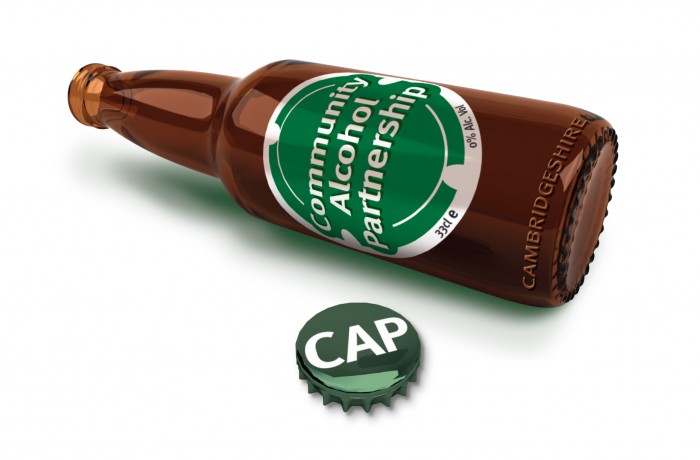
Cambridge County Council established a new local scheme called the 'Community Alcohol Partnership' or 'CAP' as it's abbreviated version. They needed a new logo and associated promotional material to communicate what the scheme represents.
We produced a clever idea of designing the logo so that it looked like the top or 'cap' of an alcohol bottle, along with this was an accompanying bottle with the full name of the scheme looking like a sticker on the side. We also added in the county name embossed on the bottom of the bottle, with the possibility the scheme could go nationwide so this could be changed depending on the county.
Back to portfolio